开发一个表单控件
上个章节我们学会了如何开发一个流程按钮,本章节将学习如何开发表单控件(又称为表单字段)。一个表单控件至少由三个组件组成:
- render —— 表单控件在表单中展现的组件
- preview —— 表单控件在表单设计器中展现的组件
- configPanel —— 表单控件在表单设计器的属性面板中展现的组件
将通过创建一个新的文本输入框,来介绍如何实现上面介绍的三个组件,以在智能表单中开发一个自定义的表单控件。
示例源码
介绍新的文本输入框
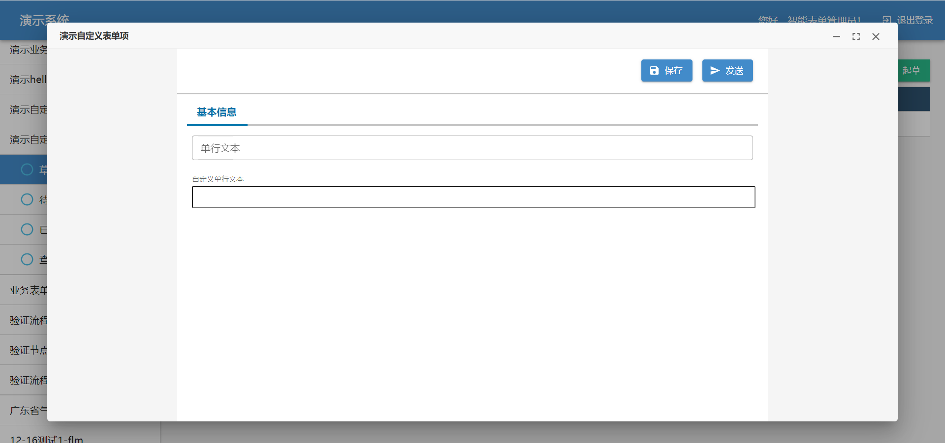
本章节开发的文本输入框,在表单中展示的效果如下图所示:
上图中在表单中出现的文本输入框,是通过 render 组件渲染出来的。
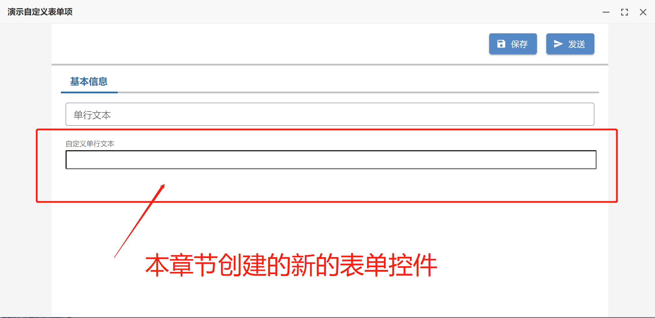
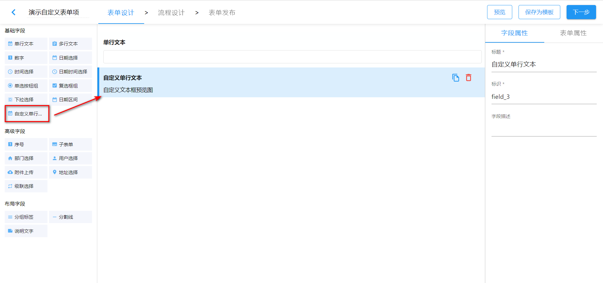
在表单设计器中展现的效果如下图所示:
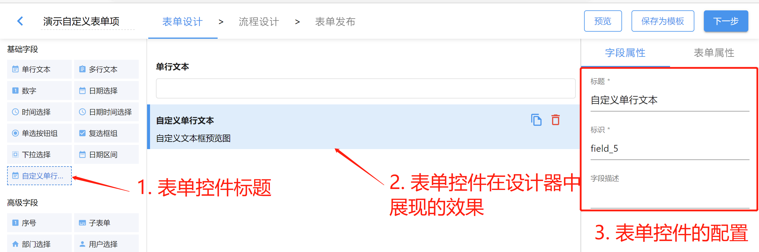
上图中三个部分是通过扩展配置定义出来的:
- 注册表单控件时指定的
title决定的 - 通过
preview组件渲染出来的 - 通过
configPanel组件渲染出来的
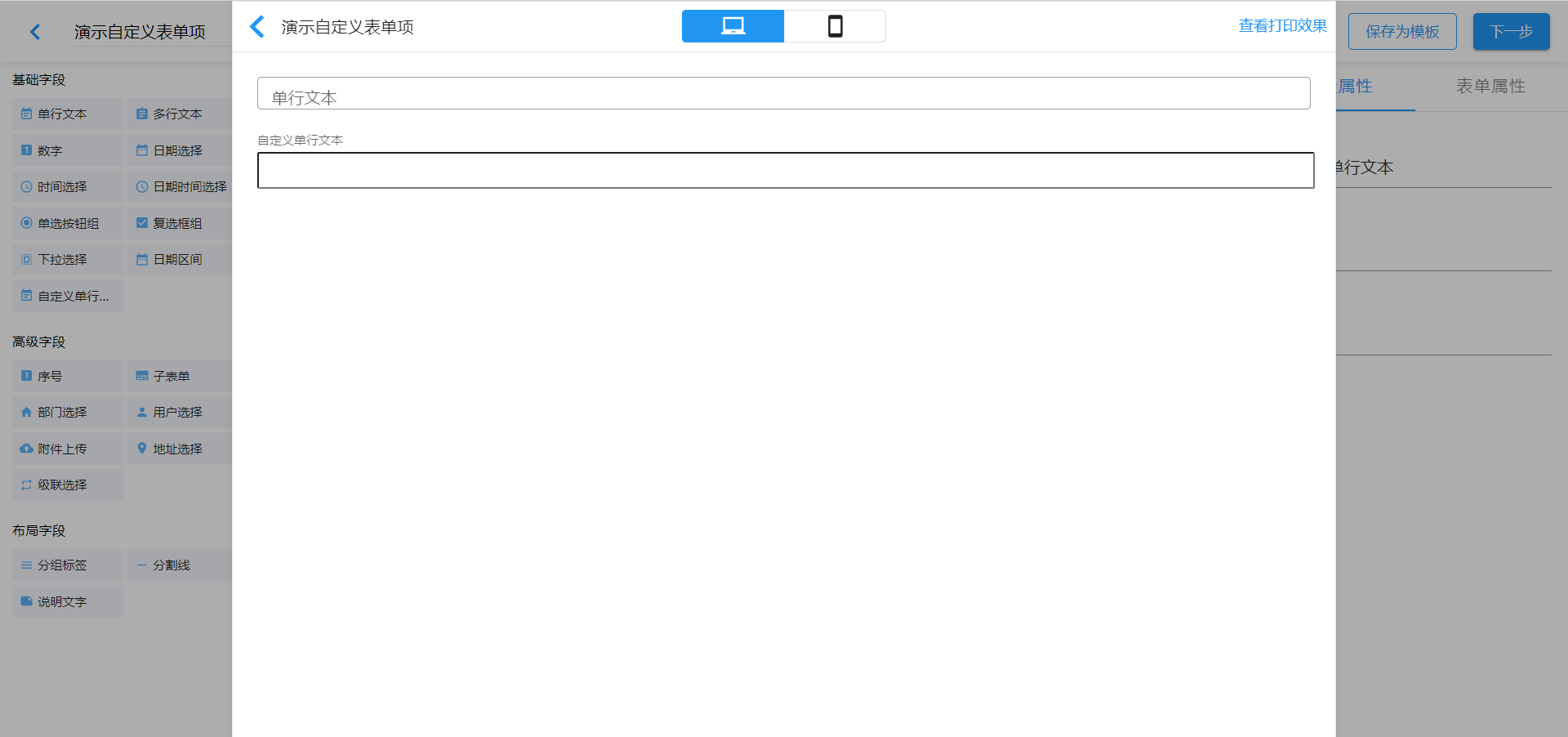
在开发表单控件过程中,也可以通过设计器的预览功能查看文本输入框在表单中的展现效果,如下图所示:
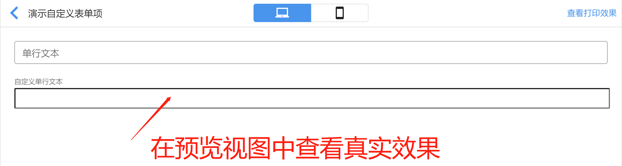
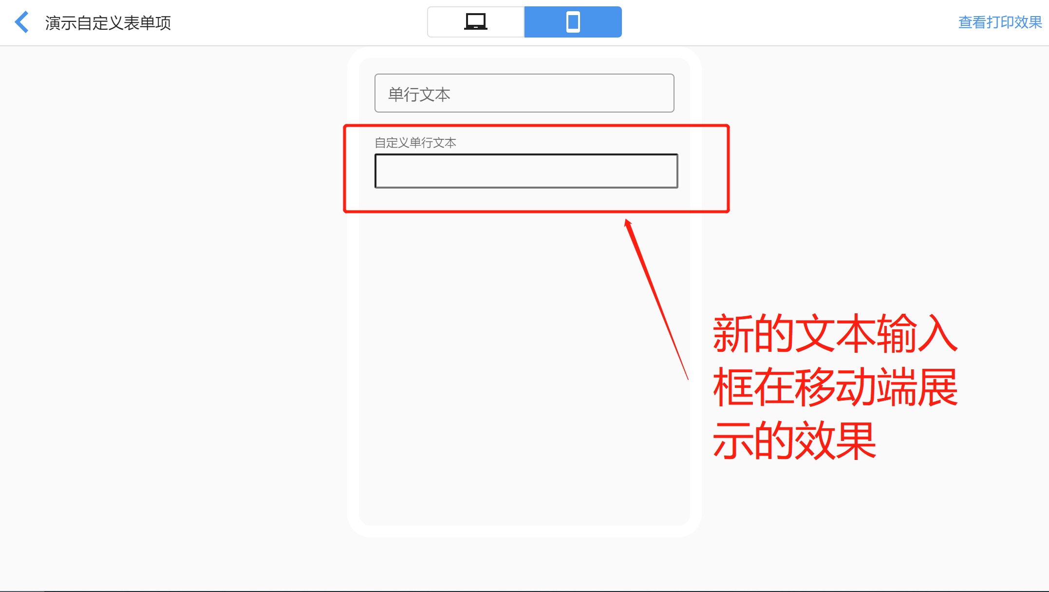
也可以在预览中查看在移动端的展示效果,如下图所示:
接下来,我们照例从 Hello, World! 开始,由浅入深地介绍如何入门表单控件的开发。
Hello, TextInput!
本节以最快的速度,开发好自定义文本输入框的三个必要组件,并注册到智能表单中使用。让我们开始吧。
首先创建三个组件,如下图所示:
📦src
 ┣ 📂plugins
 ┃ ┗ 📂form-field-custom-text-input
 ┃ ┃ ┣ 📂render
 ┃ ┃ ┃ ┣ 📜CustomTextInputRenderer.ts
 ┃ ┃ ┃ ┣ 📜CustomTextInputRenderer.css
 ┃ ┃ ┃ ┗ 📜index.ts
 ┃ ┃ ┣ 📂preview
 ┃ ┃ ┃ ┣ 📜index.ts
 ┃ ┃ ┃ ┗ 📜CustomTextInputPreview.ts
 ┃ ┃ ┣ 📂config-panel
 ┃ ┃ ┃ ┣ 📜CustomTextInputConfigPanel.ts
 ┃ ┃ ┃ ┗ 📜index.ts
 ┗ 📜index.ts
创建完成后,我们按照之前章节的经验,依次初始实现 render、preview 和 config-panel。
初始实现 render
import { SinoFormElement } from "@sinoform/plugin-sinoform-helpers";
import "./CustomTextInputRenderer.css";

/**
 * 自定义文本框在表单中展示的组件
 */
export default class CustomTextInputRenderer extends SinoFormElement {
  override render() {
    this.innerHTML = `<input class="custom-text-input" />`;
  }
}
.custom-text-input {
  display: block;
  line-height: inherit;
  font: inherit;
  color: inherit;
  -webkit-letter-spacing: inherit;
  -moz-letter-spacing: inherit;
  -ms-letter-spacing: inherit;
  letter-spacing: inherit;
  box-sizing: content-box;
  background: none;
  margin: 0px;
  -webkit-tap-highlight-color: transparent;
  min-width: 0px;
  width: 100%;
  flex: 1 1 auto;
  padding: 3.5px 0 4.5px;
  height: 1.5em;
  min-height: 1.5em;
}
import { wrapperWebComponent } from "@sinoform/plugin-sinoform-helpers";
import CustomTextInputRenderer from "./CustomTextInputRenderer";

// 包装成React组件并默认导出
export default wrapperWebComponent(
  "form-field-custom-input-renderer",
  CustomTextInputRenderer
);
初始实现 preview
import { SinoFormElement } from "@sinoform/plugin-sinoform-helpers";

/**
 * 自定义文本框在表单设计器中预览组件
 */
export default class CustomTextInputPreview extends SinoFormElement {
  override render() {
    this.innerHTML = "<div>自定义文本框预览图</div>";
  }
}
import { wrapperWebComponent } from "@sinoform/plugin-sinoform-helpers";
import CustomTextInputPreview from "./CustomTextInputPreview";

// 将web components组件封装成react组件
export default wrapperWebComponent(
  "field-custom-text-input-preview",
  CustomTextInputPreview
);
初始实现 config-panel
import { SinoFormElement } from "@sinoform/plugin-sinoform-helpers";

/**
 * 自定义文本框在表单设计器中的字段属性面板组件
 */
export default class CustomTextInputConfigPanel extends SinoFormElement {
  override render() {
    this.innerHTML = "<div>自定义文本输入框的字段属性面板</div>";
  }
}
import { wrapperWebComponent } from "@sinoform/plugin-sinoform-helpers";
import CustomTextInputConfigPanel from "./CustomTextInputConfigPanel";

// 将web components组件封装成react组件
export default wrapperWebComponent(
  "field-custom-text-input-config-panel",
  CustomTextInputConfigPanel
);
注册表单控件
打开 src/index.ts 文件,添加注册代码,如下所示:
import AppSetting from "@sinoform/app-setting";
import { FormFieldGroup } from "@sinoform/types";
import EventNote from "@sinoui/icons/EventNote";

// 注册 custom-text-input 表单控件
AppSetting.formConfig.addField({
  // 表单控件类型(相当于表单控件的唯一身份标识,不能重复)
  type: "custom-text-input",
  // 表单控件在设计器控件面板中的名称
  title: "自定义单行文本",
  // 表单控件在设计器控件面板中的分组
  group: FormFieldGroup.normal,
  // 指定表单控件在设计器的控件面板中的显示图标
  icon: EventNote,
  render: React.lazy(() => import("./plugins/form-field-input/render")),
  preview: React.lazy(() => import("./plugins/form-field-input/preview")),
  configPanel: React.lazy(
    () => import("./plugins/form-field-input/config-panel")
  ),
});
注册之后,即可启动插件项目,在智能表单设计器中使用此插件,查看表单控件的初始效果。
目前我们只是开发出了表单控件的初始效果,但是还有重要的两件事情需要处理,即:
- 表单控件与表单联动,包括值的双向绑定、表单项只读控制、标签与输入框的联动等
- 给表单控件添加合适的属性配置项,这样在使用设计器设计表单时,可以定制表单控件的行为
接下来,我们一一讲解这些内容。
表单控件与表单联动
表单控件需要与表单之间进行联动,才能在智能表单中完成它的基本功能。本节将会介绍以下四个方面的内容:
注:本节所有的内容均是在增强 CustomTextInputRenderer 组件的代码。
绑定 name 属性
在渲染表单控件的 HTML 时,可以从属性对象中获取到 name,并指定给 input 元素,如下所示:
class CustomTextInputRenderer extends SinoFormElement {
  override render() {
    const { name } = this.props;

    this.innerHTML = `<input class="custom-text-input" name="${name}" />`;
  }
}
这里的 name 是来自表单设计器字段属性配置面板的标识,如下图所示:
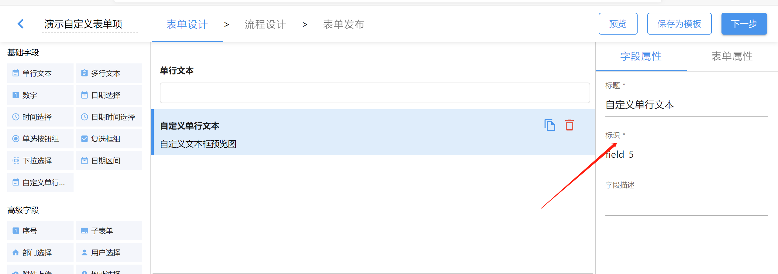
备注:后面会讲到如何定义配置面板。
名词解释:表单项
在讲值的双向绑定之前,先解释一个名词:表单项。在智能表单中,将表单控件拖拽到表单中,就形成了一个表单项。表单项最重要的两个属性是:
- 表单控件类型,即表单项对应的表单控件(
type) - 表单项标识,在字段属性面板中定义,也称为表单项名称(
name)
一个表单项有了以上两个基本属性,就可以用正确的表单控件在表单中展现正确的表单字段值。
值的双向绑定
值的双向绑定是指将表单项的值与表单状态之间进行绑定:
- 第一个方向:表单状态中的值发生了变化,需要同步到表单项,让表单项对应的表单控件显示最新的表单状态中的值。例如在打开详情页时,加载到详情页数据,表单状态中就有从后端获取到的所有表单项的值。这时就需要表单控件展示正确的来自后端的表单项值。
- 第二个方向:用户在表单控件中输入了文本,或者做出了选项选择(例如下拉选择框)后,需要将新的值同步给表单状态。
表单状态中存储了所有表单项的值。表单状态是一个对象,类似下面的示例对象:
{
  "field_1": "这是一个标题",
  "field_2": "选项一",
  "field_5": "这是一个文本"
}
上面的示例对象包含了 field_1、 field_2 和 field_5 表单项的值。我们可以通过表单项名称从表单状态中获取到表单项的值。
解释这么多,是为了让大家了解智能表单处理表单值的基本过程。我们改进 CustomTextInputRenderer 的代码,实现值的双向绑定:
import $ from "jQuery";

class CustomTextInputRenderer extends SinoFormElement {
  override render() {
    const { name, value = "" } = this.props;

    this.innerHTML = `<input class="custom-text-input" value="${value}" />`;

    const $input = $("input", this);

    // 值的双向绑定
    // 1. 监听 this.props 中的 value 属性值变更,同步到 $input 中
    // 2. 监听 $input 中的 change 事件,将用户输入的值通过 this.props.onChange 告知智能表单
    this.bindFormControl($input);
  }
}
表单项只读控制
智能表单会给表单控件的render组件传递 readOnly 属性,告知表单控件当前是只读的还是可编辑的。我们优化 CustomTextInputRenderer 的代码,以实现只读控制:
import $ from "jQuery";

class CustomTextInputRenderer extends SinoFormElement {
  override render() {
    const { readOnly } = this.props;

    this.innerHTML = `<input class="custom-text-input" ${
      readOnly ? `readonly="readonly"` : ""
    } />`;

    const $input = $("input", this);

    // 监听 readOnly 属性值的变化,同步设置 input 元素的 readonly
    this.props.watch("readOnly", (readOnly) => {
      if (readOnly) {
        $input.attr("readonly", "readonly");
      } else {
        $input.removeAttr("readonly");
      }
    });
  }
}
标签与表单控件联动
为了更好的用户体验,我们需要将表单项中的标签与表单控件进行联动,如下所示:
<div>
  <label for="userName">用户名</label>
  <input id="userName" />
</div>
上面的示例代码中,label 元素的 for 属性和 input 元素的 id 属性是相同的,它们之间就绑定了,形成联动效果,例如:当点击 label 标签,绑定的 input 会自动获取到焦点。
智能表单会渲染出每个表单项的标签和 for 属性值,并给表单控件组件传递 id 属性值,所以我们只需要在实现表单控件的 render 组件时,从 this.props 中获取到 id,并指定给 input 元素即可。如下面的代码所示:
class CustomTextInputRenderer extends SinoFormElement {
  override render() {
    const { id } = this.props;

    this.innerHTML = `<input class="custom-text-input" id="${id}" />`;
  }
}
整合在一起
现在,我们将上面的代码整合在一起,形成一个完整的 CustomTextInputRenderer 实现,如下所示:
import $ from "jquery";
import { SinoFormElement } from "@sinoform/plugin-sinoform-helpers";
import "./CustomTextInputRenderer.css";

/**
 * 自定义文本框在表单中展示的组件
 */
export default class CustomTextInputRenderer extends SinoFormElement {
  override render() {
    const { value = "", readOnly, id, name } = this.props;
    this.innerHTML = `<input class="custom-text-input" name="${name}" id="${id}" value="${value}" ${
      readOnly ? `readonly="readonly"` : ""
    } />`;
    const $input = $("input", this);

    // 值的双向绑定
    // 1. 监听 this.props 中的 value 属性值变更,同步到 $input 中
    // 2. 监听 $input 中的 change 事件,将用户输入的值通过 this.props.onChange 告知智能表单
    this.bindFormControl($input);

    // 监听 readOnly 属性值变更
    this.props.watch("readOnly", (readOnly) => {
      if (readOnly) {
        $input.attr("readonly", "readonly");
      } else {
        $input.removeAttr("readonly");
      }
    });
  }
}
至此,我们开发出了功能完整的表单控件,快在智能表单中查看一下效果吧。
完善表单控件的配置面板
接下来我们需要在配置面板中添加一些表单控件的配置项。可以使用 jQuery 开发配置面板组件,但是目前智能表单没有发布用来构建配置面板的 Web Component 组件,如果要求您通过 jQuery 和 CSS 开发出一套与智能表单保持风格一致的配置面板,工作量有点大。所以我们目前推荐您直接使用智能表单封装好的 React 组件来快速实现表单控件的配置面板。
我们调整 config-panel/index.ts 和 config-panel/CustomTextInputConfigPanel.ts 两个文件的内容:
import CustomTextInputConfigPanel from "./CustomTextInputConfigPanel";

export default CustomTextInputConfigPanel;
import React from "react";
import TextInput from "@sinoui/core/TextInput";
import { FormItem } from "@sinoui/rx-core-form";
import type { FormFieldConfigPanelProps } from "@sinoform/types";

/**
 * 定义 custom-text-input 配置面板的组件
 */
export default function CustomTextInputConfigPanel({
  inSubform,
}: FormFieldConfigPanelProps) {
  return (
    <>
      <FormItem label="标题" name="title" required>
        <TextInput />
      </FormItem>
      <FormItem label="标识" name="fieldName" required>
        <TextInput />
      </FormItem>
      {!inSubform && (
        <FormItem label="字段描述" name="helperText">
          <TextInput multiline />
        </FormItem>
      )}
    </>
  );
}
注意:我们需要将
CustomTextInputConfigPanel.ts文件的后缀改成.tsx。
敬请期待
在不久的将来(数周内),我们会在 API 文档中说明配置面板中有哪些可用的 React 组件。您以后可以参考 API 文档中的组件清单,快速定制出您需要的表单控件配置面板。
小知识点
您可以通过 render 组件的 config 属性获取到表单项在设计器中的配置,如下所示:
class CustomTextInputRenderer extends SinoFormElement {
  override render() {
    const { config } = this.props;

    console.log("表单项的配置", config);
  }
}
至此,我们开发出了一个完整的表单控件。接下来您可以在智能表单产品中调试该表单控件。
在智能表单产品中调试插件
打开登录页,使用账号 智能表单管理员(密码是:1qaz2wsx!) 登录系统,然后选择表单设计器,进入智能表单管理页面。
打开表单演示自定义表单项,在表单设计界面可以在左侧的基础字段中看到新增的自定义表单项,拖动它到中间区域就可以完整自定义表单项的添加。
打开预览界面就可以实时测试自定义表单项的功能。
进入产品示例系统,在演示自定义表单项的表单详情页中也可以测试自定义表单项。